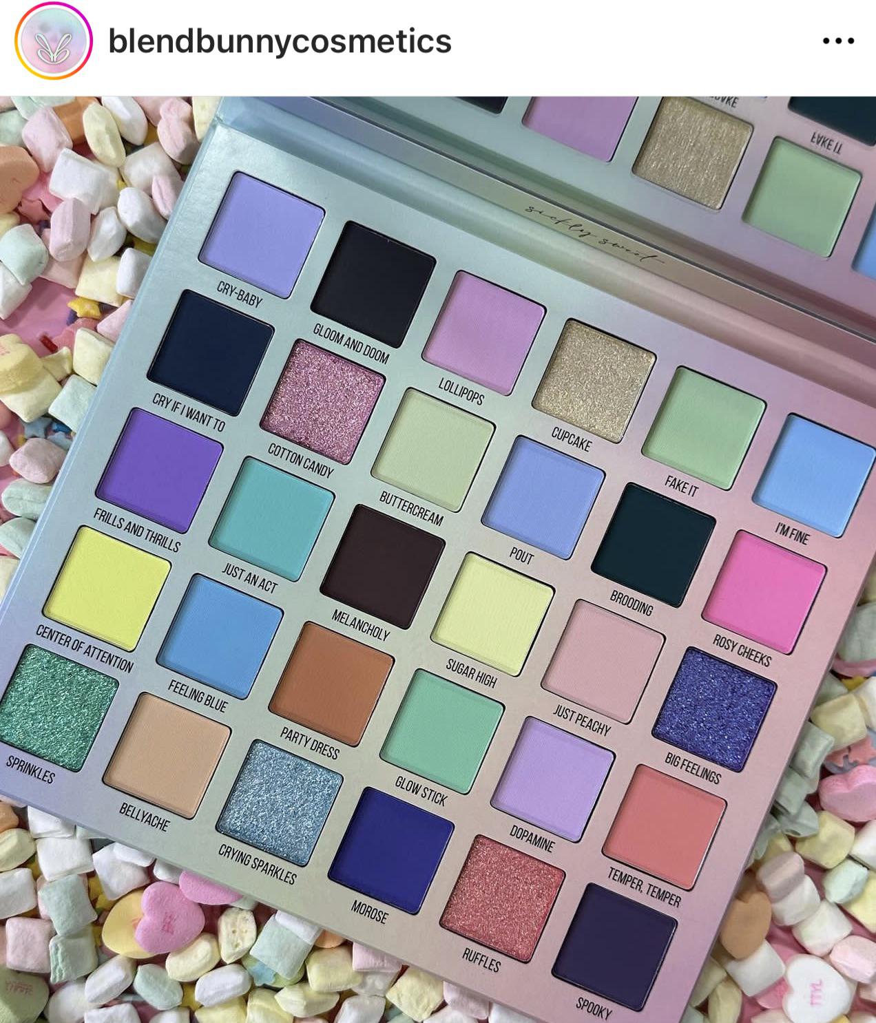
Seems like a very weird time to release a pastel palette, this should be for spring.
Intrepid_Leopard_182 on
Funny time of year for this color story, but I’m excited to see Angelica Nyqvist go wild on these pastels!
drivesIowhomie on
so many repetitive shades
meandbeans on
And they lost me. I’m a big fan of how orderly their other palettes have been so you could really see the gradient and I thought that was one of their brand defining characteristics and then they put this out. Its not that i don’t like it at all its just that my brain was searching for the organization here. Like do i make looks out of rows or columns or quads? This is an easy pass for me.
krlygns on
This looks wildly unorganized to me, and not even in an inspiring way.
PhyrraNyx on
I love the colors but omg the layout is killing me. It is not aesthetically pleasing to my eyes.
RandomUsername600 on
I really like the colour scheme but all their palettes are too big.
OdeeSS on
Everyone is going to have different opinions about the layout and I’m fine with that, but I do notice that it’s really difficult for me to detect the undertones if the darkest shades when it is laid out like this. I’m also having a really difficult time understanding which colors would go in each column if it was sorted chromatically.
That said, Blend Bunny did say after their Sugar and Grunge palette that they would be changing up the layouts of their palettes, so I’m not surprised.
I’m curious to see how these swatch and if the lightest and midtone shades would be appreciably different.
I, unfortunately, look like I’m being strangled to death anytime I try to wear pastels. They clash so hard with my skin 😂😂😂
rosaygold on
This feels like it makes no sense 😪 The color story is somehow gross to me. Some of these have so much potential and yet it feels so off.
terfnerfer on
Pleasant to look at in pan. But I feel like the risk for these looking chalky on the eyes is….significant
putonmyskepticles on
“party dress” and it’s terracotta lmao
I wish they would’ve laid it out nicer.. looking at my Surge palette is so pleasing with the gradients and this is a mess.
lily4ever on
‘Buttercream’ not being the pale yellow shade is hurting my soul 🥲
GlitteryFab on
This reminds me of that Los Angeles palette BH Cosmetics put out a few years ago.
GeneKelly_TapShoes on
I thought this was an Easter palette. Why are there candy hearts in the background?
mrsharlot on
It’s giving Lorac brunch palette extended edition
amazinglyshook on
This reminds me of those memory games where you have to flip random two cards to get a match and try to clear the board. It’s fun in practice but terrible if you’re trying to match colors for a look.
Each shade themselves are pretty, but as a color story, I’m not even sure what it’s supposed to be.
Almacat9 on
Well, Natasha Denona Pastel Midi Palette is discontinued and everybody on youtube seems to brag about the amazing pigmentation this brand haves… I’m temped but wish more than half of those were shimmers.
deep-fried-fuck on
Other than agreeing with this being odd for a fall release, I do think it’s pretty and a color story I don’t feel like I’ve already seen 20 times in the past 2 years
tvaddict70 on
If anyone is going to do good pastels, it should be BB. Unfortunately, not a palette I would be looking to use at this time of year. I’m too excited to get back into the richer shades of fall and winter
niniela-phoenix on
the layout is horrible compared to all the other neat palettes they released. Imma have to go crop this sorted by color to even comprehend the story here
Murphy_mae14 on
This order hurts. I can’t even tell if I would like it because it seems such a mess
PacificaJane on
Idk I rly like this palette. It’s something different for the brand and it’s fine.
pale_atlantis on
I can’t stop looking at the five random almost black shades…
Few_Temperature_6262 on
I’ll be getting this
niniela-phoenix on
Extremely fugly Photoshop job but here’s the colorstory sorted roughly by colors.
Because I genuinely couldn’t tell what’s in there in that chaos.
I just don’t like these large, all over the color scheme palettes any more. Makes you think you are getting your money’s worth but if you look closely it dupes itself several times and you really only get two or three distinctive looks.
GreenVenus7 on
Two MS Paint mockups of how I might’ve organized the color story to be more pleasing
It’s a tentative pass for me. In general I like Blend Bunny, but I also already own the Glamlite Ice Cream palette, and that one seems like a much more cohesive pastel palette of the same size.
eldritch_eyeliner on
I said it before and I’ll say it again, make smaller palettes! They’re fully duping themselves (both in the same palette in with shades they already have) and this layout is atrocious.
lesliealmeida on
AT BEST, this looks like a VERY LATE winter-to-spring transitional palette. I can see some of these being holiday party shades, but most seem like spring or spring-to-summer.
MsGloriaM on
This reminds me of the Playing in Makeup By Yolondo pastel palette for some reason. I don’t own it but it looks oddly similar.
SalonFormula on
Here are some swatches. I am going to pass on this one.
Hm, okay. This is such a weird release for Blend Bunny. Time of year aside, isn’t their thing having gradients in their palettes? This is like….all pastel with a few deep mattes. Also, didn’t Bella Beaute Bar just (okay, maybe months ago) release a massive pastel palette that people were raving about? Not really sure what hole this fills. Without their name in the photo, I could not tell you what brand made this. I feel like that’s pretty bad, since they genuinely stood out in the indie scene :/
Can’t wait for YouTubers who “aren’t into big palettes/don’t normally like pastels” to try and convince me I NEEEEEED this lol. I’m normally not that cynical, because I do love my Surge from BB, but y’all know it’s gonna happen lmao
neko_courtney on
One thing I always loved about Blend Bunny is how the palettes are organized. This one is disappointing to say the least.
TheOGPotatoPredator on
It looks like a big Cosmic Brushes palette, like if Serenity and Delights had illicit sex and had a giant love child whose eyes occasionally resembled those of Uncle Muse at a certain angle.
Anyway, I like it.
applewheatsoda on
My god this is hideous. I understand the owner not want to be associated with same things but my god this feels like it was done randomly just to spite. “Never expect anything from me!”
Im an artist. I cant figure out exactly the color story at all by looking at this. A big reason is because theres extremely light and extremely dark almost black colors. By being so random with such high contrast, my brain cant process whats going on 😩 what an unpleasant palette jfc
angryturtleboat on
Man. I see a giant clusterfuck of chalk.
iDonutsMind on
This is way too big for what it is. Makeup brands need to learn to edit down. Those dark shades don’t look like they’re different from each other at all (in the pan, anyway).

38 Comments
Seems like a very weird time to release a pastel palette, this should be for spring.
Funny time of year for this color story, but I’m excited to see Angelica Nyqvist go wild on these pastels!
so many repetitive shades
And they lost me. I’m a big fan of how orderly their other palettes have been so you could really see the gradient and I thought that was one of their brand defining characteristics and then they put this out. Its not that i don’t like it at all its just that my brain was searching for the organization here. Like do i make looks out of rows or columns or quads? This is an easy pass for me.
This looks wildly unorganized to me, and not even in an inspiring way.
I love the colors but omg the layout is killing me. It is not aesthetically pleasing to my eyes.
I really like the colour scheme but all their palettes are too big.
Everyone is going to have different opinions about the layout and I’m fine with that, but I do notice that it’s really difficult for me to detect the undertones if the darkest shades when it is laid out like this. I’m also having a really difficult time understanding which colors would go in each column if it was sorted chromatically.
That said, Blend Bunny did say after their Sugar and Grunge palette that they would be changing up the layouts of their palettes, so I’m not surprised.
I’m curious to see how these swatch and if the lightest and midtone shades would be appreciably different.
I, unfortunately, look like I’m being strangled to death anytime I try to wear pastels. They clash so hard with my skin 😂😂😂
This feels like it makes no sense 😪 The color story is somehow gross to me. Some of these have so much potential and yet it feels so off.
Pleasant to look at in pan. But I feel like the risk for these looking chalky on the eyes is….significant
“party dress” and it’s terracotta lmao
I wish they would’ve laid it out nicer.. looking at my Surge palette is so pleasing with the gradients and this is a mess.
‘Buttercream’ not being the pale yellow shade is hurting my soul 🥲
This reminds me of that Los Angeles palette BH Cosmetics put out a few years ago.
I thought this was an Easter palette. Why are there candy hearts in the background?
It’s giving Lorac brunch palette extended edition
This reminds me of those memory games where you have to flip random two cards to get a match and try to clear the board. It’s fun in practice but terrible if you’re trying to match colors for a look.
Each shade themselves are pretty, but as a color story, I’m not even sure what it’s supposed to be.
Well, Natasha Denona Pastel Midi Palette is discontinued and everybody on youtube seems to brag about the amazing pigmentation this brand haves… I’m temped but wish more than half of those were shimmers.
Other than agreeing with this being odd for a fall release, I do think it’s pretty and a color story I don’t feel like I’ve already seen 20 times in the past 2 years
If anyone is going to do good pastels, it should be BB. Unfortunately, not a palette I would be looking to use at this time of year. I’m too excited to get back into the richer shades of fall and winter
the layout is horrible compared to all the other neat palettes they released. Imma have to go crop this sorted by color to even comprehend the story here
This order hurts. I can’t even tell if I would like it because it seems such a mess
Idk I rly like this palette. It’s something different for the brand and it’s fine.
I can’t stop looking at the five random almost black shades…
I’ll be getting this
Extremely fugly Photoshop job but here’s the colorstory sorted roughly by colors.
Because I genuinely couldn’t tell what’s in there in that chaos.
https://preview.redd.it/pt235nopiupb1.jpeg?width=1127&format=pjpg&auto=webp&s=f147de0c01c6299859e1a133b316fa0294d6140c
I just don’t like these large, all over the color scheme palettes any more. Makes you think you are getting your money’s worth but if you look closely it dupes itself several times and you really only get two or three distinctive looks.
Two MS Paint mockups of how I might’ve organized the color story to be more pleasing
https://preview.redd.it/gdl1k9untupb1.png?width=3450&format=png&auto=webp&s=e0b4ebc87745ed81f7fb5faa4565652ff7f07b48
It’s a tentative pass for me. In general I like Blend Bunny, but I also already own the Glamlite Ice Cream palette, and that one seems like a much more cohesive pastel palette of the same size.
I said it before and I’ll say it again, make smaller palettes! They’re fully duping themselves (both in the same palette in with shades they already have) and this layout is atrocious.
AT BEST, this looks like a VERY LATE winter-to-spring transitional palette. I can see some of these being holiday party shades, but most seem like spring or spring-to-summer.
This reminds me of the Playing in Makeup By Yolondo pastel palette for some reason. I don’t own it but it looks oddly similar.
Here are some swatches. I am going to pass on this one.
https://preview.redd.it/lkw1nnwzjvpb1.jpeg?width=1289&format=pjpg&auto=webp&s=3de49e2edd7b1cafb5097a1095447ace05aa8eac
Hm, okay. This is such a weird release for Blend Bunny. Time of year aside, isn’t their thing having gradients in their palettes? This is like….all pastel with a few deep mattes. Also, didn’t Bella Beaute Bar just (okay, maybe months ago) release a massive pastel palette that people were raving about? Not really sure what hole this fills. Without their name in the photo, I could not tell you what brand made this. I feel like that’s pretty bad, since they genuinely stood out in the indie scene :/
Can’t wait for YouTubers who “aren’t into big palettes/don’t normally like pastels” to try and convince me I NEEEEEED this lol. I’m normally not that cynical, because I do love my Surge from BB, but y’all know it’s gonna happen lmao
One thing I always loved about Blend Bunny is how the palettes are organized. This one is disappointing to say the least.
It looks like a big Cosmic Brushes palette, like if Serenity and Delights had illicit sex and had a giant love child whose eyes occasionally resembled those of Uncle Muse at a certain angle.
Anyway, I like it.
My god this is hideous. I understand the owner not want to be associated with same things but my god this feels like it was done randomly just to spite. “Never expect anything from me!”
Im an artist. I cant figure out exactly the color story at all by looking at this. A big reason is because theres extremely light and extremely dark almost black colors. By being so random with such high contrast, my brain cant process whats going on 😩 what an unpleasant palette jfc
Man. I see a giant clusterfuck of chalk.
This is way too big for what it is. Makeup brands need to learn to edit down. Those dark shades don’t look like they’re different from each other at all (in the pan, anyway).