
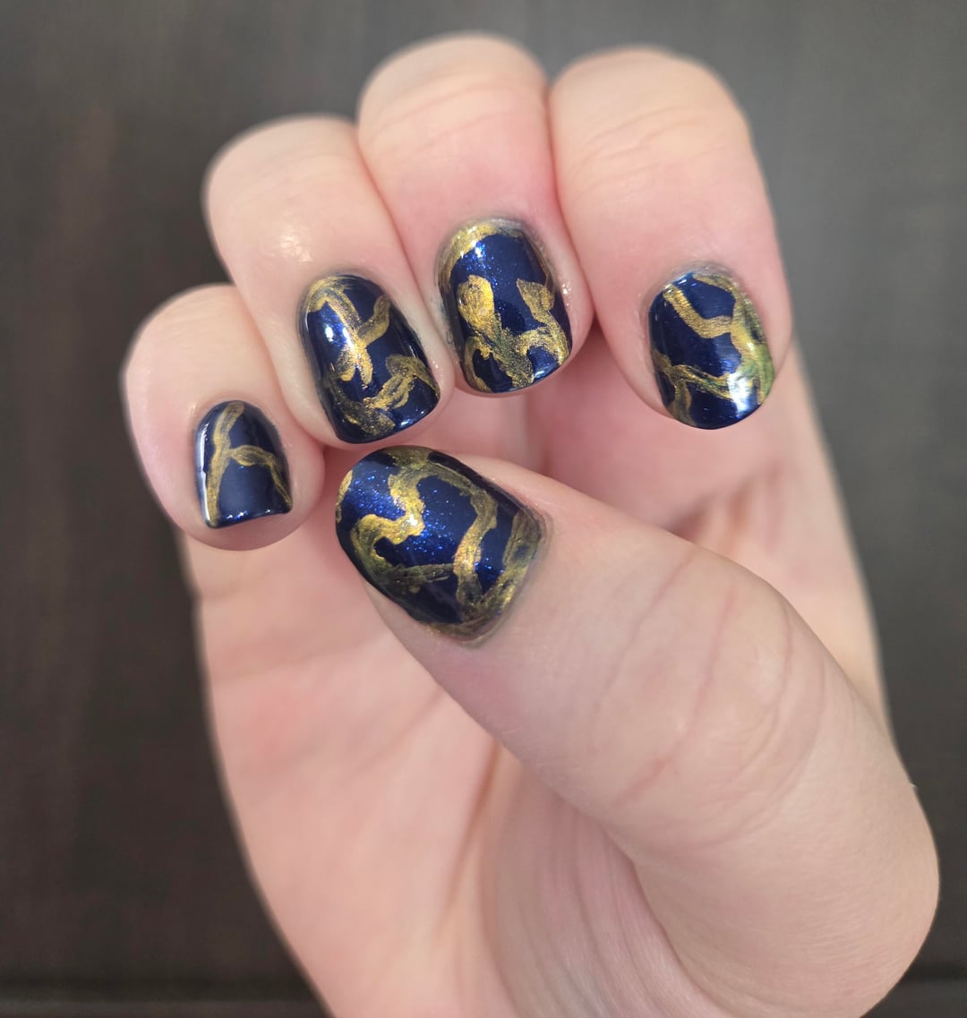
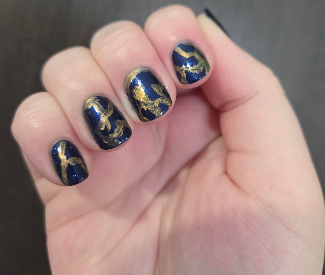
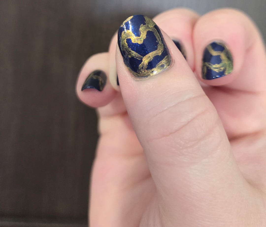
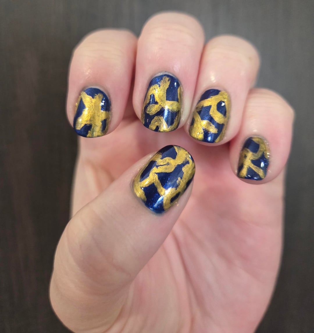
I tried making it look like kintsugi pottery because I've always thought those were so pretty. I originally wanted to make it make a particular reference photo that had brush strokes. Sort of showing off this darker blue and a slightly brighter, shimmery blue. The shades I have are way too similar though so you couldn't see the difference lol. I'll have to try again some other time. I also tried too hard to make the lines have definition other than being straight. I want to make them thinner next time
Sally Hansen Color Therapy Strengthening Base Coat x1
China Glaze One Track Mind x1
OPI Chopstix and Stones x1
Atomic Polish Au Gold x1 on my right hand and x2 on my left
Sally Hansen Miracle Gel Top Coat x1
by RoseOfTheAbyss
1 Comment
Neat. I think finer lines would be the ticket. If you have a paint bush that is just 3 or 4 bristles that would help achieve finer lines.